Anywhr's Own Itinerary Planning Tool
Scaling & optimising trip tlanning for all kinds of tripsResponsibilities
Design system, Itinerary Planning flows, and leading interaction design
Team
Product Interns - Li Wanying, Andy Chan, Audrina Aziz
Duration
5 months (concurrent with Itinerary Display on consumer web app)
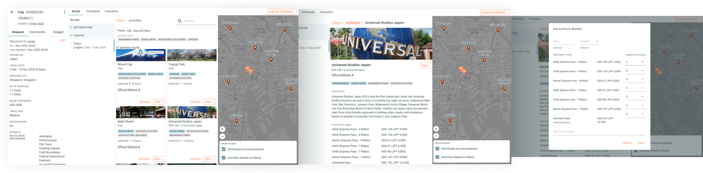
The Itinerary Planner is one of the main features of Anywhr's existing internal operations platform, Llamafarm. It aids Trip Curators in deciding destinations, accommodations, activities, and transportation. The resulting itinerary is presented on Anywhr's consumer-facing web app.
Problem
It was difficult for Trip Curators to handle a larger volume of trip planning requests if the period of time it takes for them to complete one trip takes too long.
Disregarding the number of Trip Curators Anywhr had as a factor, the team decided that maximising the number of itineraries planned in a day while minimising the time it takes to confirm and book a customer's trip is the first step to scale up trip planning operations.

Why is it time-consuming for Trip Curators when they plan trips?
As Anywhr believes in designing unique travel journeys, each travel itinerary is planned based on the customers' travel interests and preferences which was highly time-consuming to prepare. Multiple tools are used to present information about the itinerary to the customer, such as a document for the itinerary content and a spreadsheet for the cost breakdown.
Trip Curators find that the more detailed an itinerary is, the more time and effort it takes to amend itineraries, hence they choose to build up the itinerary part by part and get confirmation from the customer on destinations and accommodations first, before moving on to activities and transport. This process results in a much longer comunication loop as both the Trip Curator and the customer need to wait for each other to reply.
Goals
This feature aims to become a solution that helps address these needs:
- Facilitate the exchange between the customer and Trip Curator after the trip request is submitted.To minimise the time needed for the feedback and communication loop, which was identified as the bottleneck in lead conversion.
- Reduce the time and effort taken to put together an attractive itinerary for the customer.Trip Curators place importance on making the itinerary look visually appealling as it helps the customer to place trust in the service which they are paying a premium for.
As the content types within the itinerary are still evolving through trial and error, the challenge lies in designing modularly as we anticipate that the needs of the Trip Curators will change according to the itinerary.
Approach
Finding out the common pattern of trip planning
There was a general pattern to how Trip Curators planned trips, which consists of 3 main phases:
With this and the assumption that itinerary content no longer need to be manually written up, the overall journey of how trip planning could be was drawn up and agreed upon with Trip Curators as such:

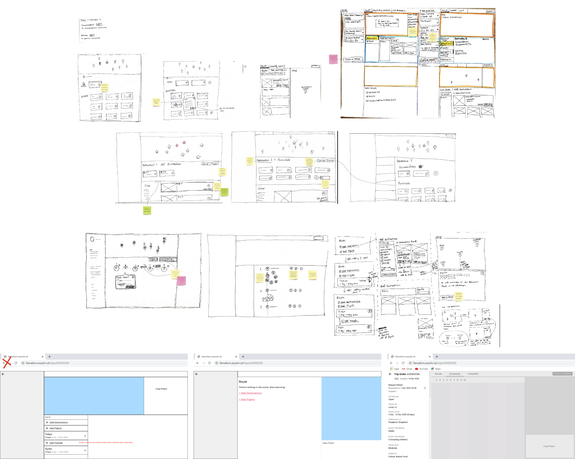
To start, I decided to set the screen layout and overall look of the design system so that different user flows and pages can be designed simultaneously. We studied various websites and apps that had similar features to get a feeling about interactions and layouts people are familiar with and started sketching ideas on the layout and functions. We rapidly prototyped our ideas to test the usability of the layout with Trip Curators and confirmed the layout after a few rounds of testing.
Adapting Consumer-facing Web App's Styleguide to speed up MVP design process
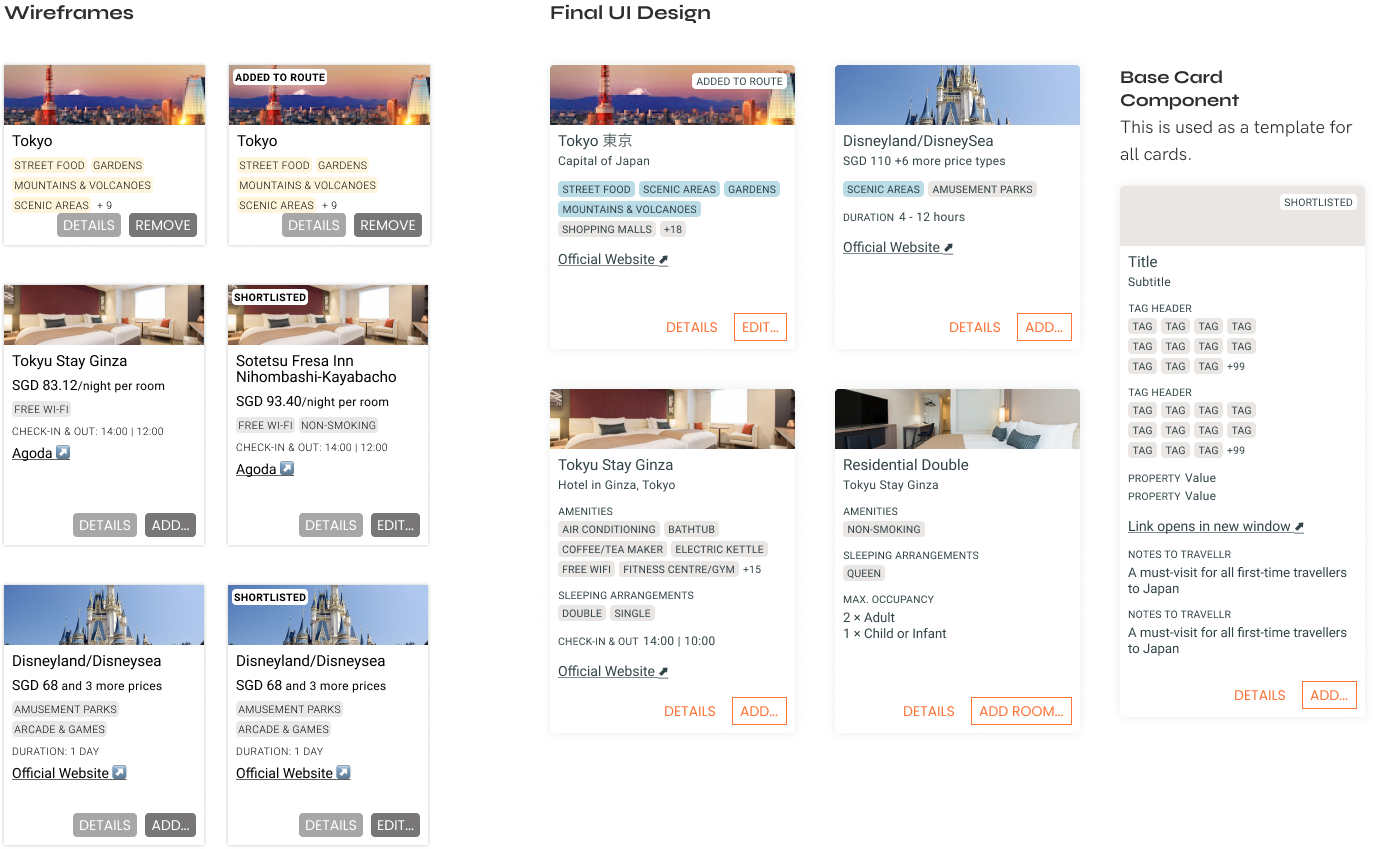
The existing UI style guide developed for the consumer-facing site without consideration for a data-heavy interface. Using the same styles will lead to a lack of screen estate due to the large fonts and white-spaces. I designed a version of the style guide with these constraints to be used for Llamafarm.

Creating a Modular Design System
With the style guide in place, I came up with a basic Design System which made prototyping and designing quicker while ensuring designs from different designers are came together looking like a single whole app. This was important so Developers do not waste time building similar components that look a little different each time.
Designing in Phases According to Segmented User Journey
Having sketched the feature in its entirety before deep diving and figuring out the details,I planned the design timeline according to segmented user task flows such that the team could work in an agile fashion.
Further defining features based on user work flows
How the function work was diagrammed as work flows first to draw up a logical understanding and flow before rapid prototyping to gradually work towards the final UI.

Keeping engineers in the loop before hand-off helped define the functionality and behaviour of components as any questions and confusion were raised while design was still work-in-progress.


Learnings
Importance of defining terms used to refer to parts of the interface and itinerary - without this, it can get pretty confusing very quickly. Appropriate terminology should be used to discern betwwen similar but different components and functionalities so that we could communicate effectively across the entire team.