Anywhr Brand Refresh: New look for a new direction
A branding update with new brand colours and typographyResponsibilities
Creating a brand guide and updating existing component style guide
Stakeholders
Marketing - Zelia Leong
Duration
2 weeks
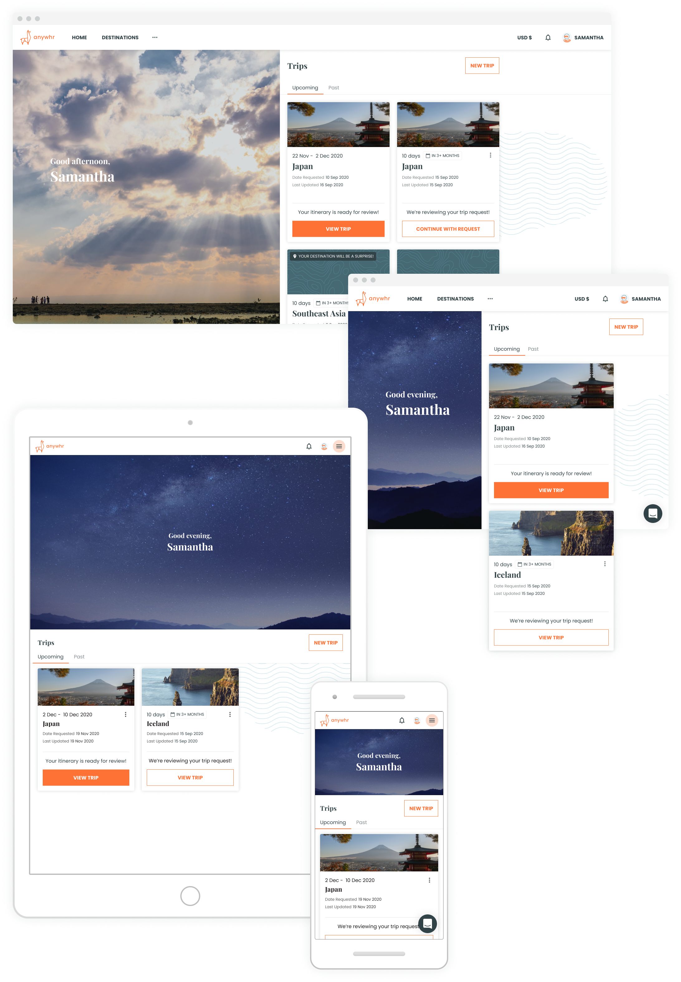
The refreshed visual identity should still be familiar enough to people who already know Anywhr, yet different enough to reflect the change of direction in Anywhr’s trip planning services: we are no longer just planning surprise trips. Together with the head of Marketing, we refreshed Anywhr's branding to project a more sophisticated image while still keeping it looking fun.
Problem
We wanted to appeal to audiences in their late twenties to thirties, but when we asked our target audience what they thought about the brand, we realised that it looked too young and seemed to target a slightly younger crowd. Words used to describe the brand included cute and childish, which was not what we intended.
We realised that the tetradic colour scheme with the quirky illustrations made the brand seem soft and playful as if made for children. So the lower-effort change was to use a more straightforward brand palette with fewer colours instead. The original brand colour also looked too bright on certain displays, especially mobile phones, and was often mistaken as a red instead of pink.
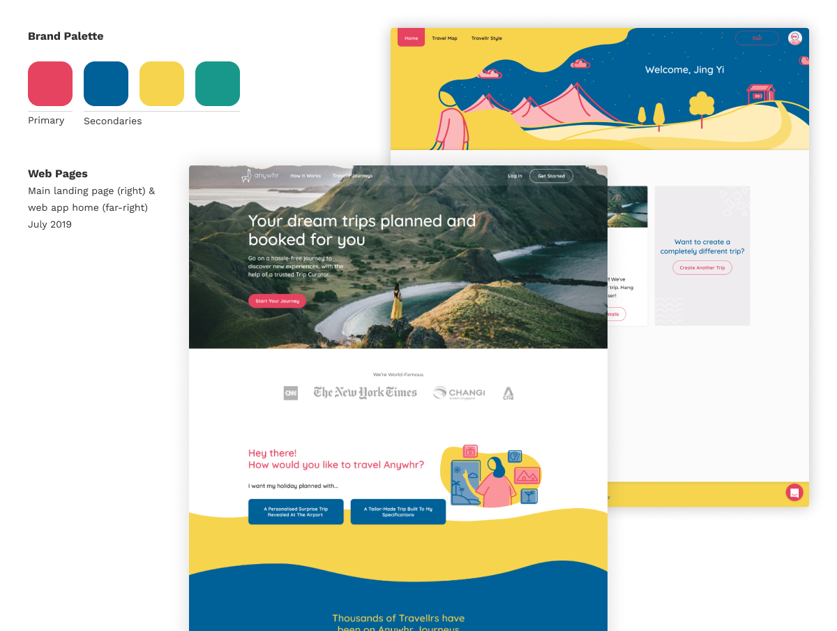
Colours: Energizing, Optimistic, Trustworthy
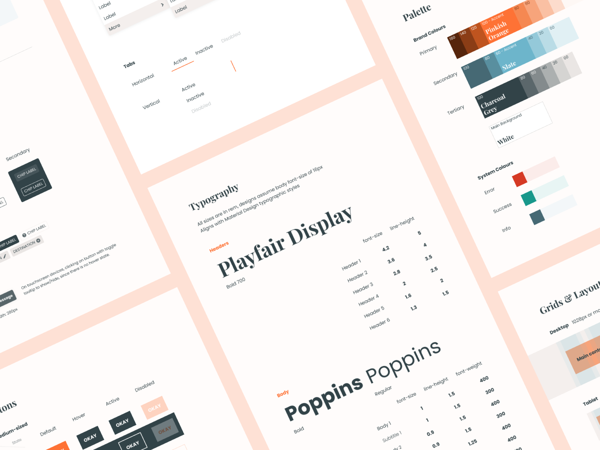
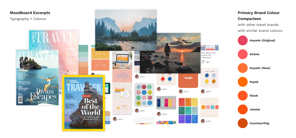
In colour psychology, Orange is a colour of motivation, positivity, and general enthusiasm for life. So it's also no wonder many travel companies also use orange as their brand colour. It is also not contrastingly different from Anywhr's original brand colour of pink, and I made sure that the shade of orange for Anywhr's brand is different from other well-known brands.
For a simpler palette, I decided to go with just one complementary colour for the secondary colour. A calmer blue balances with the vibrant orange, and is known for its trust and dependability.
Typography: Sophisticated, Fun & Simple
Playfair Display caught our eye. We instinctively thought that this font encompassed the feelings we wanted the brand to exude. It was great for Anywhr's website headings as a display serif typeface but too different from the original san-serif type used in the logo. Hence, the font selected for body text will need to be used in the logo as well.
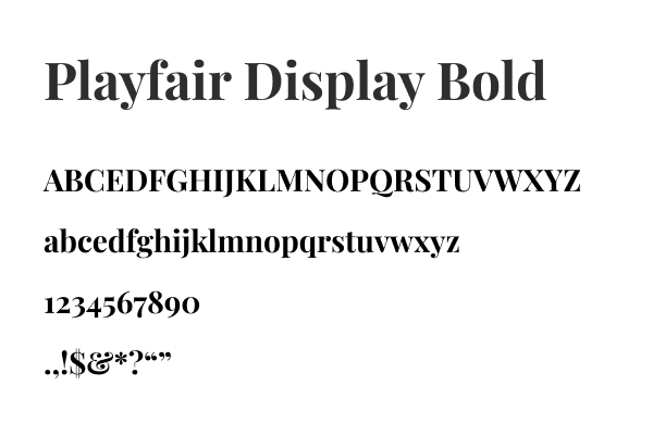
Selecting the font for both body text and the logo wordmark
The font needs to:
Pair well with Playfair Display.
Be available in multiple weights and italics; for the text to be styled suitably in articles.
Be a sans-serif; as the header font was already a serif, having any other typeface apart from a sans-serif would be over the top.
Be commercially free-to-use, such as from Google Fonts; I have no budget to purchase font licences.
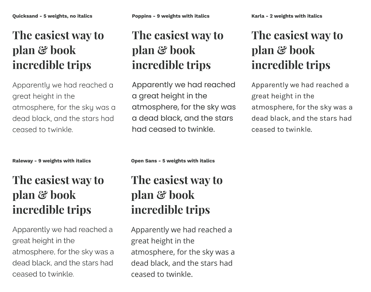
After shortlisting a few fonts which met all requirements, I narrowed it down to Poppins as it has the same typographic variant as Quicksand -- both font families have the single-storey lower-case letter a.
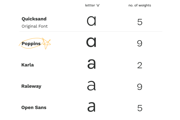
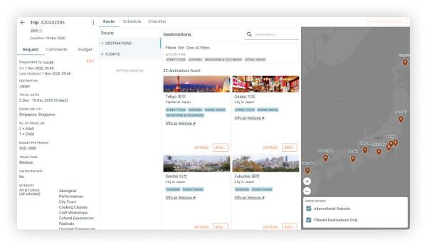
Poppins also has nine font weights available, which would be useful for setting the typographic styles for Anywhr’s utility app. The high-contrast and space-consuming Playfair Display font is unsuitable for the utility app because it has a data-heavy interface.
Making logo's wordmark more legible at small sizes
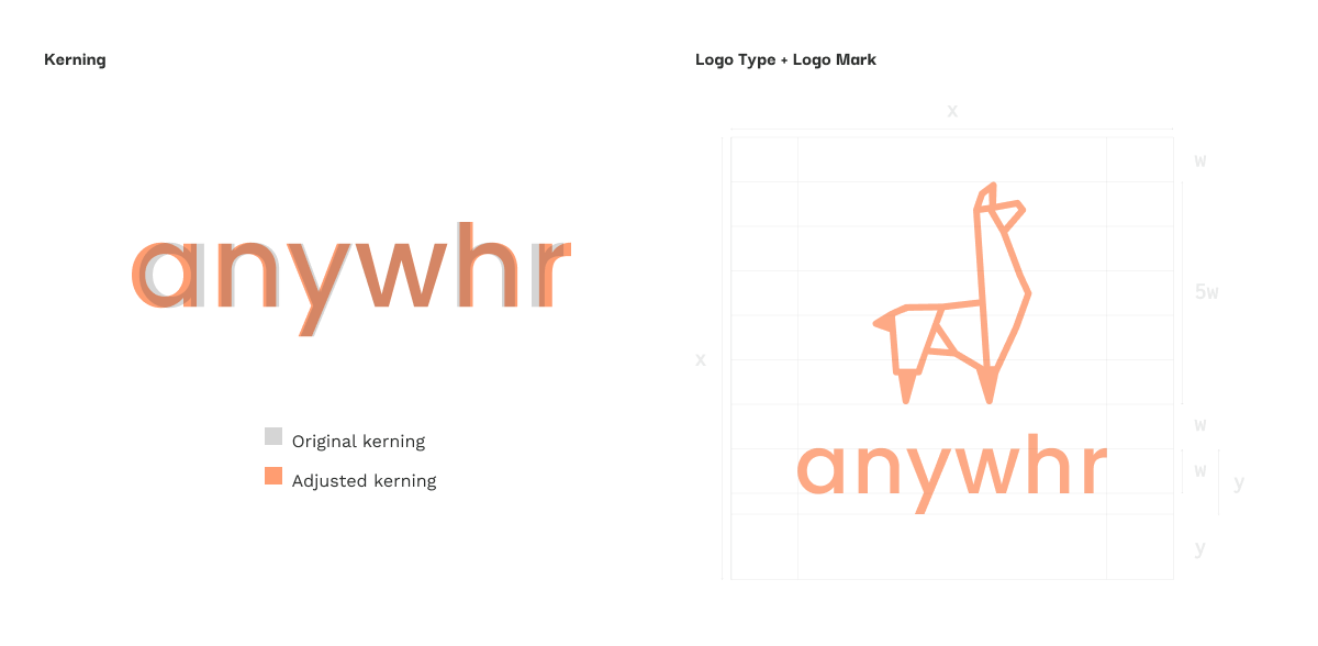
The original logo wordmark was using Quicksand. The weight of the font was too light which made it difficult to see the word 'anywhr' when displayed in the website's navigation menu.
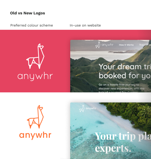
So, I took this chance to make slight improvements to the readability of the wordmark with the new font. The original llama motif in the logo was kept the same as it was a widely recognised element that people recognised and associated with Anywhr.
