Anywhr Redesign: Trip Customisation & Web App
Increasing users' confidence towards a new and unconventional travel experienceResponsibilities
User research, UX, UI, Web Page Styling
Team
Product Manager - Felix Tan, Engineering - Filbert Teo & Sim Aik Chun
Duration
6 months (Including development)
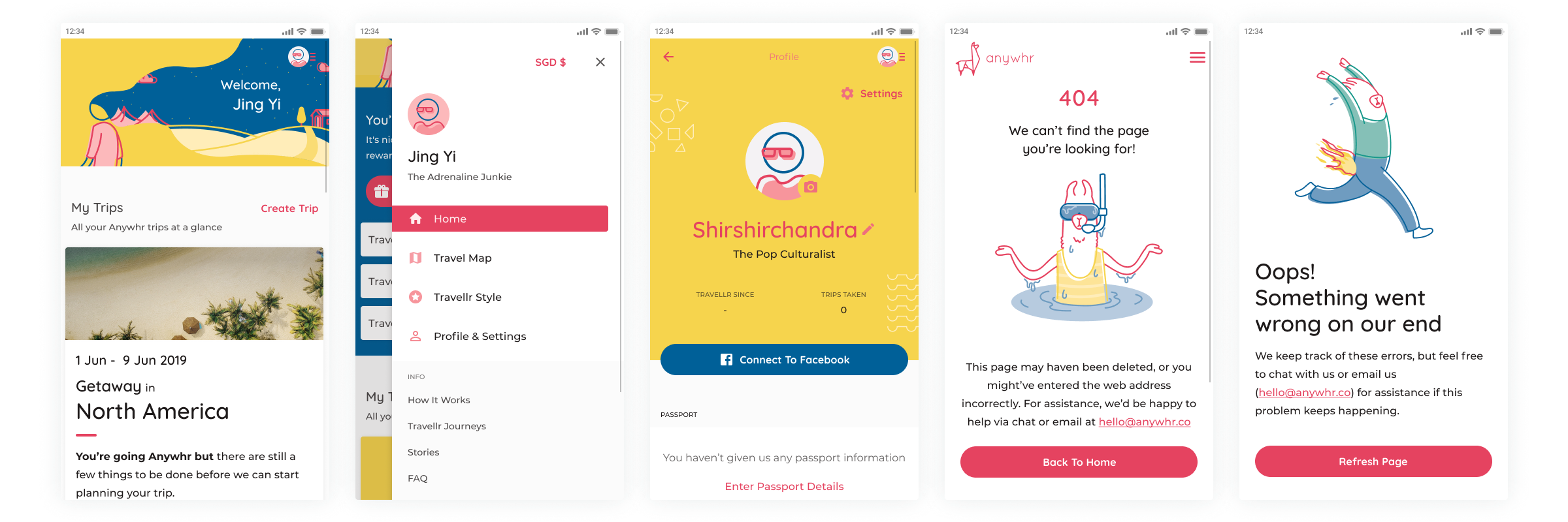
When I first joined Anywhr back in January 2019, my first task was to redesign Anywhr’s Web App to improve conversion rate and also incorporate the new branding in the redesign. With web analytics showing that most users access the website on their mobile devices, I approached the design from a mobile-first perspective to optimise the user experience for the majority of users. It was also important to identify features that provide the most value to users and the business to launch an MVP quickly, then add on other features to the web app iteratively.
Process
I was involved in the initial stages of user research and problem discovery to helping out on the front-end development by styling web components.

Making sense of prior happenings and knowledge
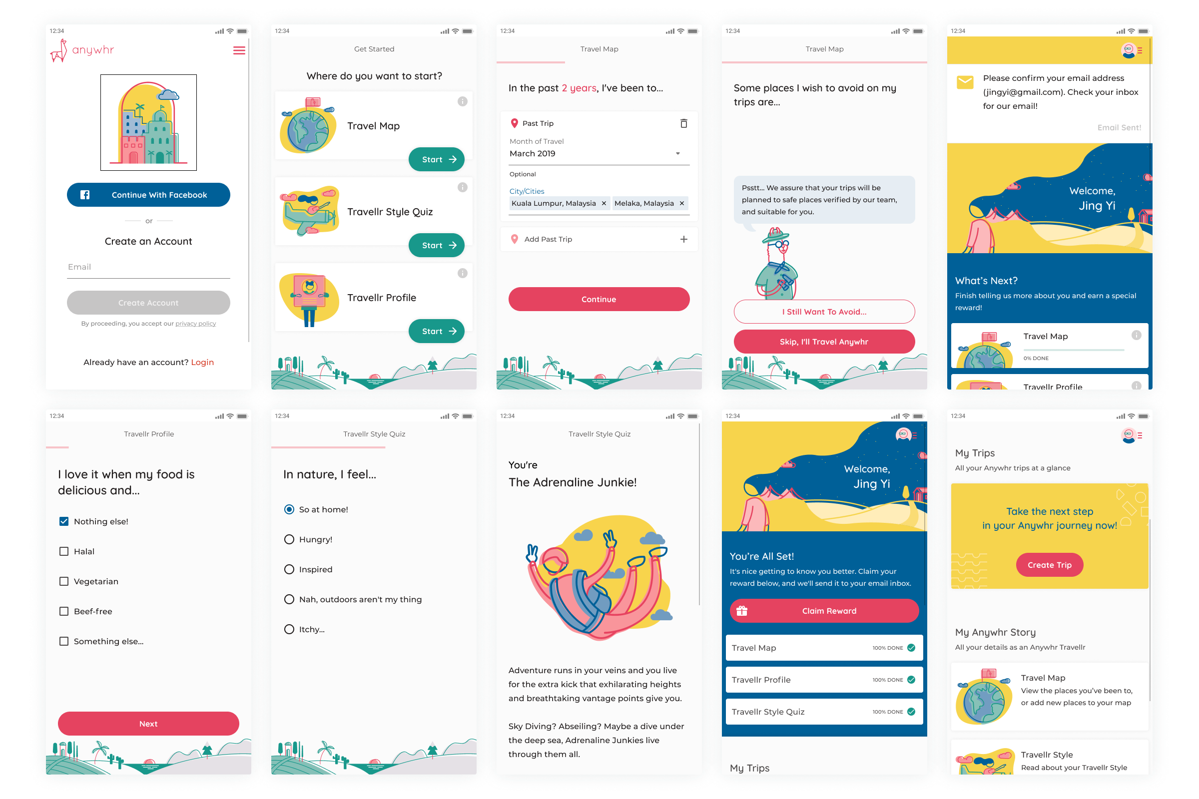
To quickly familiarise myself with the product, I got people who were more familiar with the product — those who have been planning the trips, interacting with customers, and creating content for Anywhr’s social media, to jot down their thoughts regarding what could be improved and what could be the ideal scenario for customers. I then organised these notes on a Customer Journey map which gave me a starting point for crafting the questions for further user research.
Concentrating on the group of users who customised an Anywhr trip for the first time and have yet to book any trip, I conducted interviews to find out their experience with using the website and their expectations of travel and trip planning and also compiled a list of things that current and past travellers wrote on their preference forms that were submitted after they booked a trip.
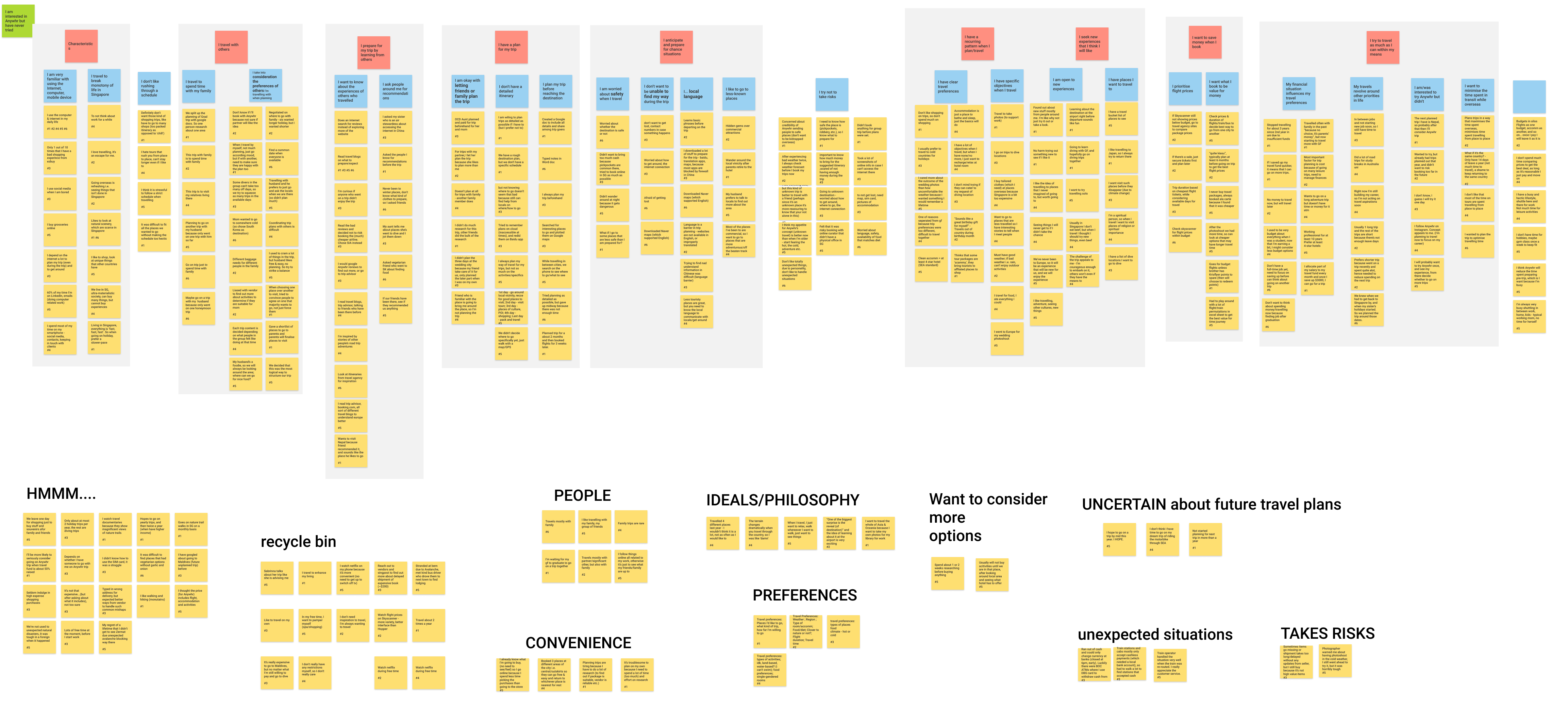
The user interviews indicated two prominent areas for improvement.
Many users did not fully understand the booking process or what's going to happen after entering their details and paying. In one case, a user did not realise that he will be able to declare his medical condition as this is only asked about in a Travel Preference Form after the trip is booked in a separate online form before he books. Even though this was mentioned on the ‘How it works’ page, many users missed it as they usually headed straight to customising a trip. This lack of understanding contributed to the user lack of trust in Anywhr as a trip planning service.
Almost all interviewed users wanted the cheapest flights and the most value-for-money lodgings. When they were customising their trip, more often than not, their attention was on the increasing trip price as they continued selecting their desired trip options.
Reducing the time spent on miscellaneous tasks by Trip Curators who plan travellers' trips to optimise efforts on actually planning the trip.
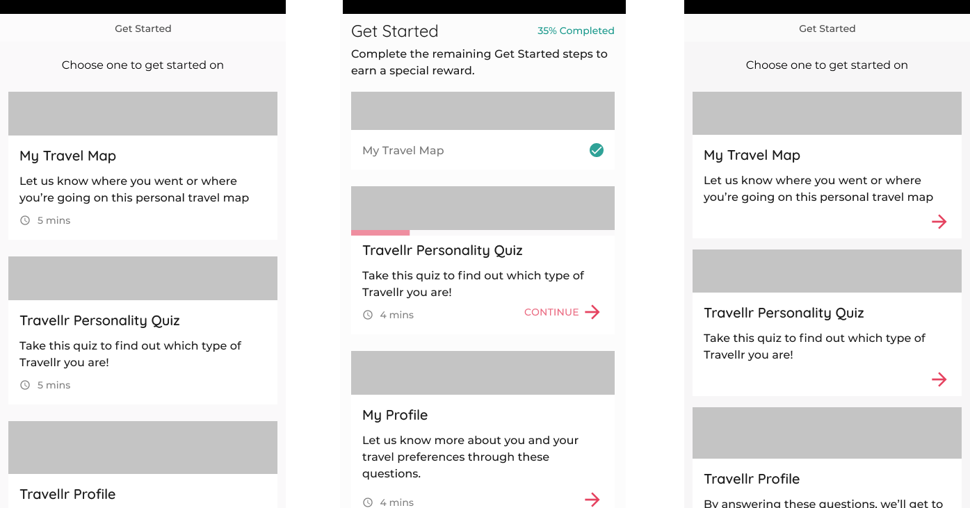
The Travel Preference Form was a third-party created form and it was time-consuming for users as they had to submit a new form each time they booked even though there were details that would have been entered the same way almost every time (i.e. personal particulars, passport details). It was inefficient for Trip Curators as the form responses had to be exported every time a new response was submitted. We decided to design the web app such that all information required from the user would be collected at different points in the process of onboarding the user.
This decision then raised concerns about users getting bored and dropping off mid-way answering these questions. As established by the numerous feedback from past travellers, the main reason why travellers loved their trip was that even though they did not know their destination and could not know what they were going to do on their trip, the trip still turned out great.
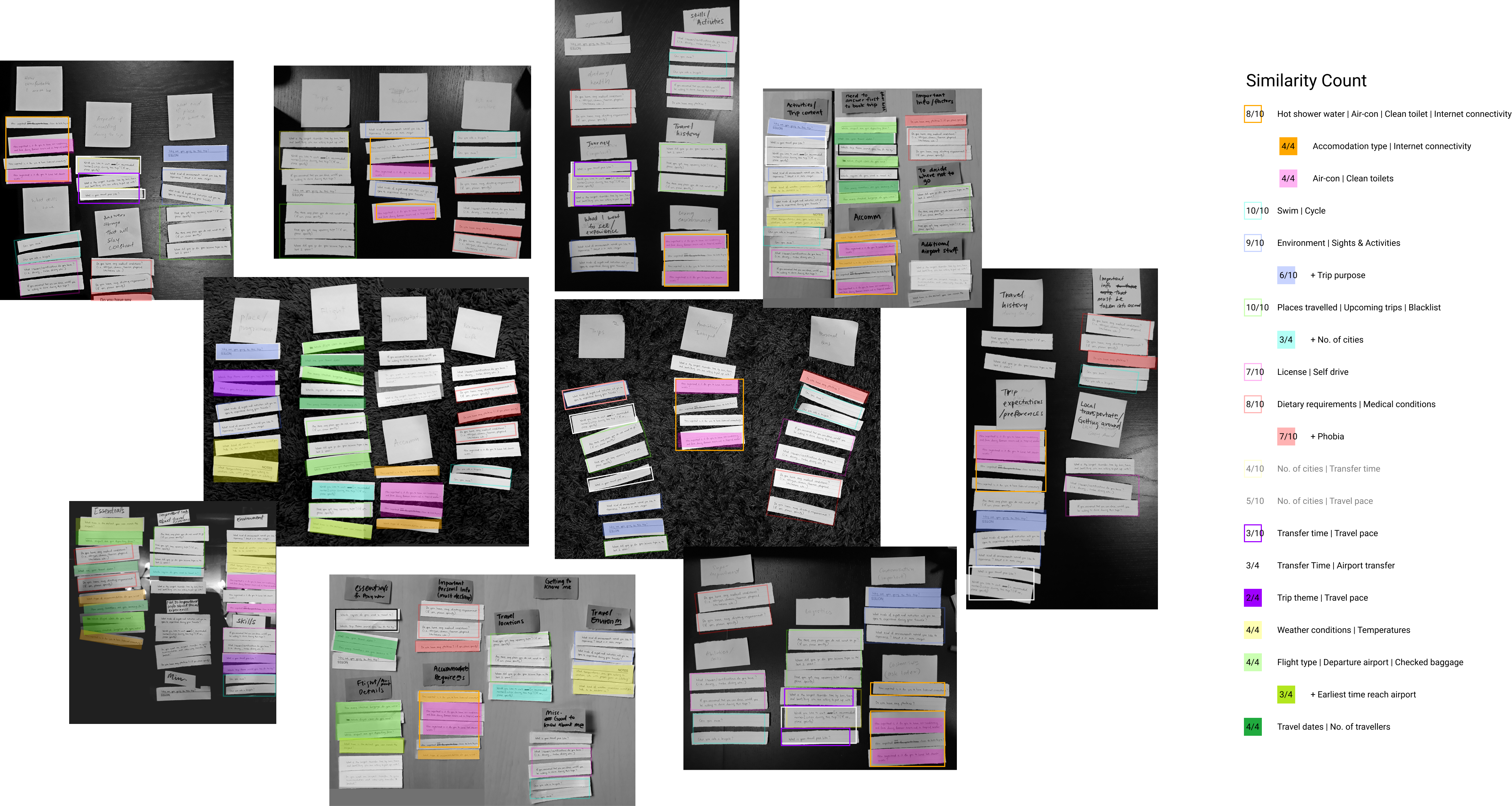
Brainstorming and prioritising the information we need from travellers
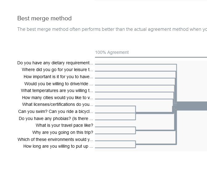
Planning trips that travellers enjoy is only possible if Trip Curators understood the preferences of the travellers they plan the trips for, and to do that we needed to ask users many questions, similar to how it takes time to understand someone in real life. Getting together with two of the most experienced Trip Curators and the product manager in a workshop, we brainstormed and prioritised questions to only ask necessary questions to reduce the user’s time and effort taken to answer these questions.
Iterative prototyping
I sketched paper prototypes to test the phrasing of questions and input types to answer those questions. Users who tested the prototypes expressed that there were no unnecessary questions and could not think of anything else that they failed to convey about themselves and their expectations of the trip, but I noticed that they also started getting listless after getting through about two-thirds of the questions. Further user tests of the lo-fi prototype solidified the fact that there were just too many questions for a user to sit through in a single session.
Mixing in a bit familiarity of users' usual trip planning habits
Looking back at the interviews, many users mentioned that the process of planning their trip usually takes the form of multiple research sessions done over a few months. To take a cue from that, the total length of questions were broken up into three chunks based on the type of information and whether the user’s answer would change from trip to trip.
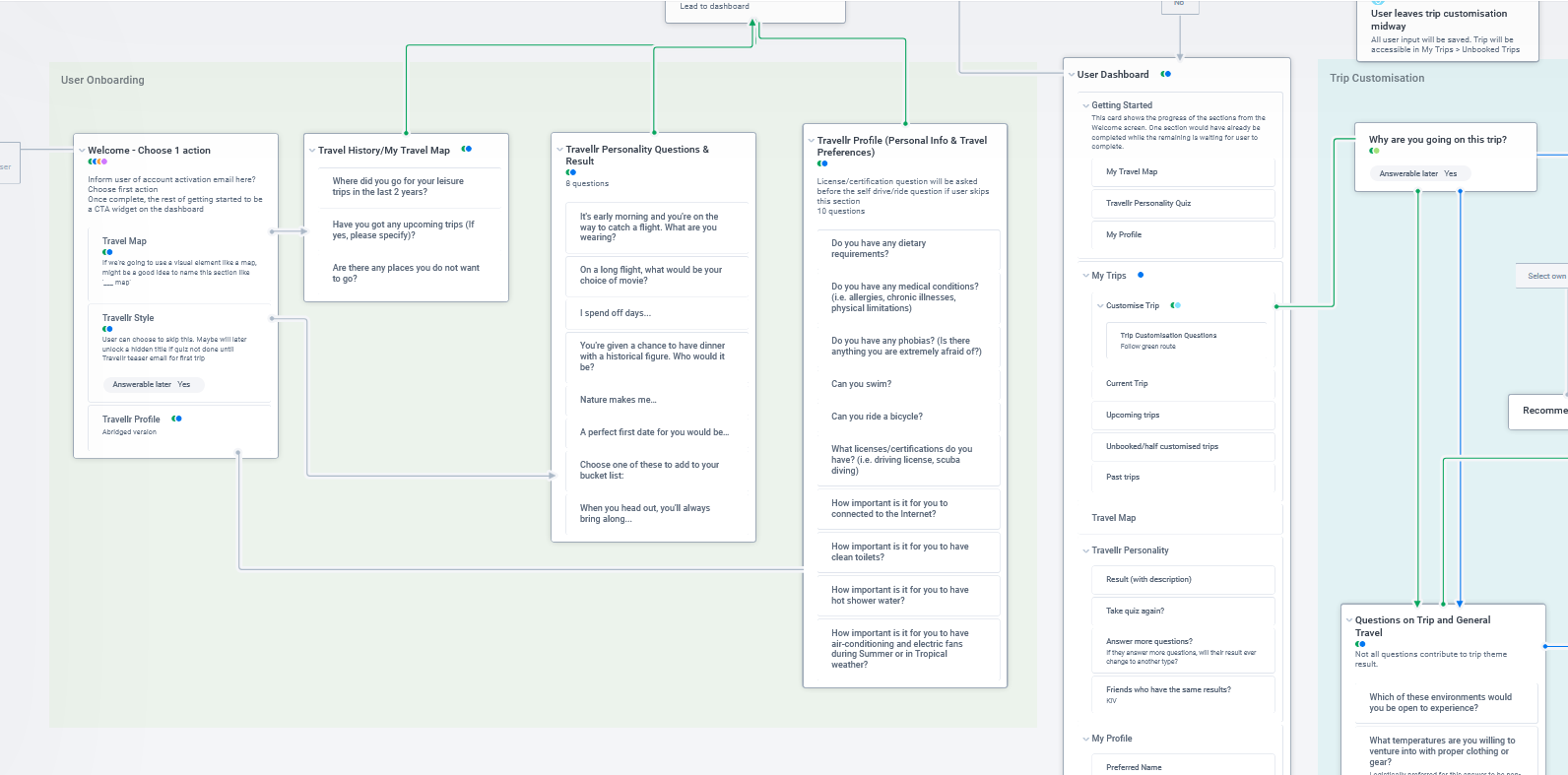
Instead of forcing the user to sit through all sections before they could get to customise their trip, we allowed them to pick the one that seemed most interesting to get started with and incentivised them to return to the other 2 sections whenever they wanted.
Placing a stronger focus on the priceless journey
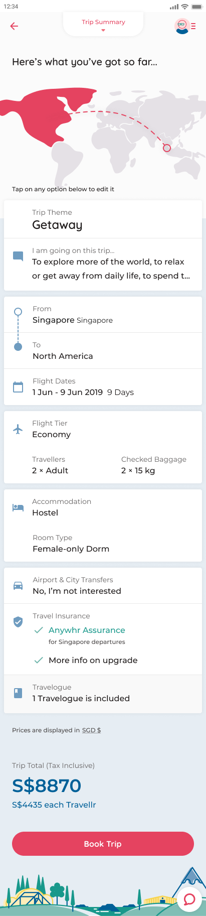
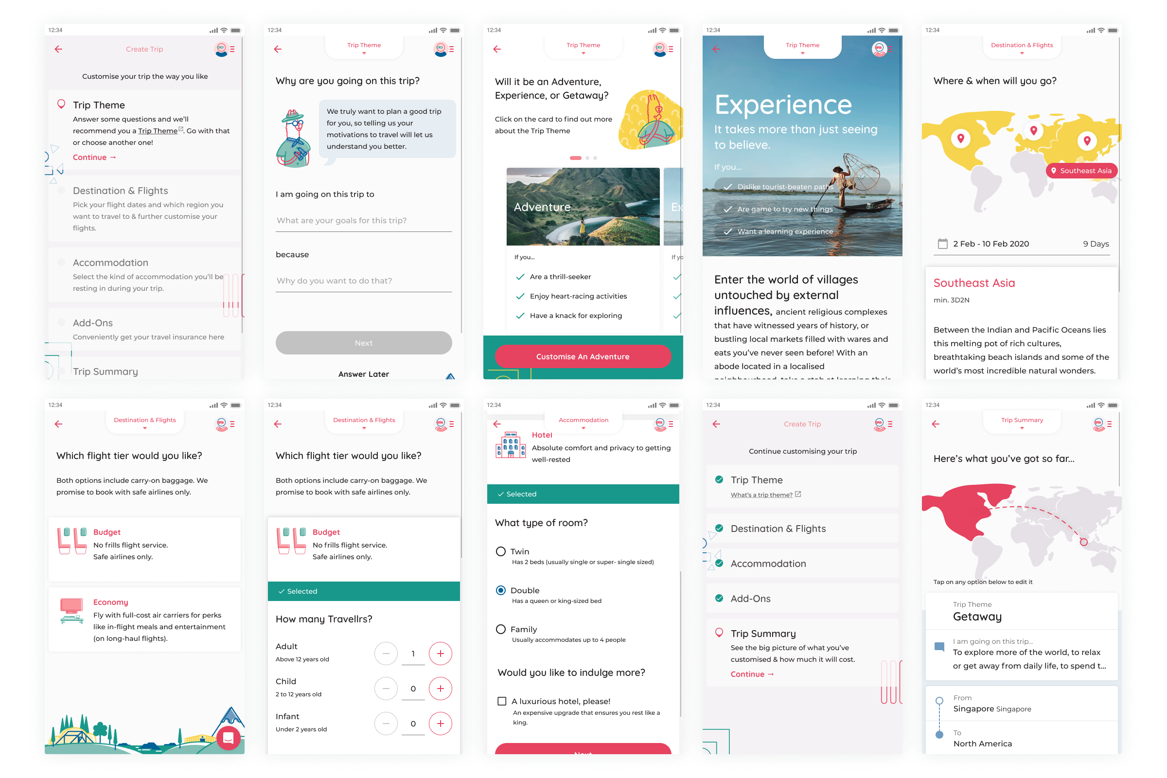
In the original trip customisation interface, users could see the price of the trip reflected at the same time as they customise their trip. It started at the minimum price which only kept increasing as they changed their trip options, and many users quickly took notice of the increasing trip price and would try to play around with the trip options to lower the price.
Almost all interviewed users wanted the cheapest flights and the most value-for-money lodgings. To divert the user's focus on maximising the tangible benefits from a commercial transaction, I decided to place more emphasis on the personalisation of a travel experience that cannot be fully quantified by money by only showing the price on a summary page after the user has selected their desired options. User tests showed that users still tried changing their options, but could do so easily by identifying and editing the options they would prefer to compromise quickly from the summary page.
Me
Post-launch
After a few months since the redesigned web app was launched, there was a consistent activation rate between 80 to 90% and the average basket size increased even though the number of bookings remained consistent. General feedback from users was that the website was responsive, easy to use, and aesthetically pleasant.
Through this project, I learnt that it was important to lay down the overall structure of the web app so that engineers could start working on it early and provide feedback to any possible technical challenges that could cause delays in the timeline which design could help allay.